SAP has been a pioneer in producing software for managing business processes and innovating solutions for enhanced Data Processing. They have modules that help various business departments, from ERP to Warehouse management. We at Mobolutions design, develop, and deliver utility management products based on the SAP cloud platform.
In the current fast-paced world, Businesses (users) are looking for mobile-based applications which can be handy, accessed from anywhere and can be easy to take action.
SAP mobile platform start allows human beings in all traces of commercial enterprise and throughout procedures and industries to carry out the proper obligations on the proper moment.
This blog will list the few things that we must look at before designing an SAP suite for a Mobile Platform.
- Know your Users.
- Think about the Platform.
- Design based on the process.
- Visual Elements.
- Conclusion.
Know your Users:
Keeping our users in the forefront while designing leads us to build a user-friendly product, which businesses look for. In case, we are working on an Enterprise Timesheet application for an Organization which manufactures Engine Parts for Cars. This application’s Design is based on broad scenarios (for say) – Admin, Manager and Technician. For each user mentioned, there would be a user journey.
Scenario: In a Plant Maintenance Process, Technicians (users) are not supposed to take mobile phones inside the workplace. Technicians may or may not be given the authority to create/approve Tasks on the go. At the same time, an Admin can Approve and Create tasks. They have the responsibility to manage the team and its overall performance. Focusing on these scenarios while designing mobile apps is also particularly important. The Designed application should fulfil the most prioritized work for the users based on the user scenarios
Think about the Platform:
The Design for an application also varies based on the platform used by the user. It may be Mobile, Web, or Tablet. We cannot visualize the same content in the same style for all the devices. There needs to be an alternate way to showcase the content for the user.
For example, Using Analytical tables for displaying data is a desirable choice for Web and Tablet platforms. But if you want to visualize the same information on mobile platforms, you must choose a Card or a smart table. Using Cards would provide a good readability experience.
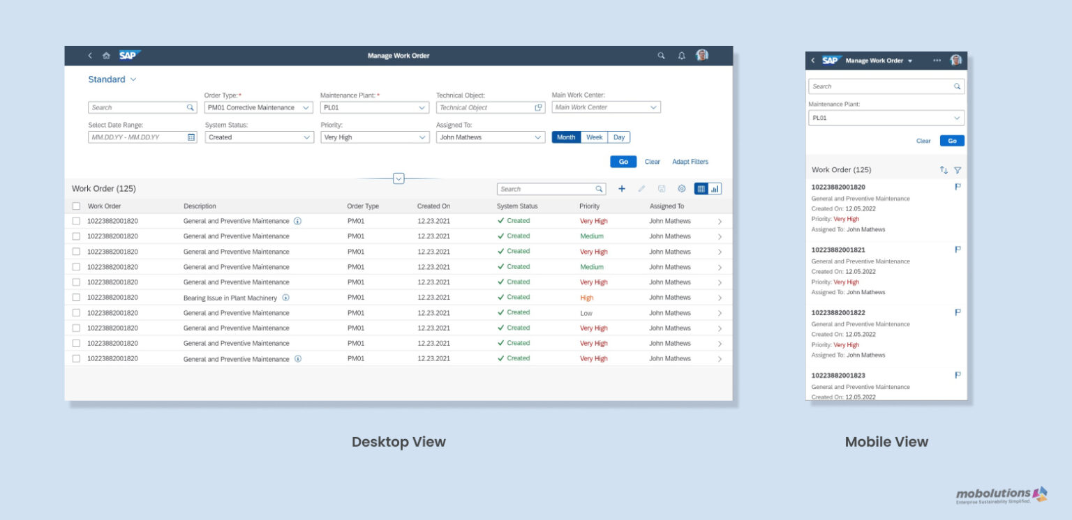
Fig 1: Comparison of Manage Work order screens in Desktop vs Mobile View
Design Based on the Process:
SAP has a set of standard procedures on how every module application should work. The process also includes the modules connected to the current application we are designing, so the application suite will always be on the flow. The Design which we plan for applications should compromise the process.
Since we are now discussing mobile designs, it is more important to know what features to add to the mobile platform. For example, only Displaying the Work order documents with “Hold”/“Flag” functionalities can be given to a mobile application, restricting “Create” and “Edit” functionalities since it requires lots of procedures and F4s to create and edit a Work order.
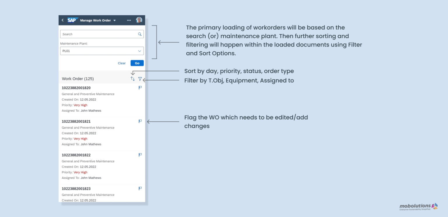
Fig 2: Mobile View of Manage Work order Explained.
In the above diagram, the primary work orders are based either on the Search (or) Maintenance Plant. Further sorting and filtering will occur within the listed Work order documents using the “Sort & Filter” Options. These Options reduce the loading time of the application. And the “Flag” option holds the work order process in the system, which we can edit/update on the desktop.
Likewise, the Design should be planned for the mobile platform without deteriorating the process.
Visual Elements:
The visual elements, like buttons, vary in size for WEB and Tab and Mobile Platforms. For a Desktop platform, the interaction of users with visual elements used to be with a cursor. Those elements should be larger in a Mobile Platform when compared to that of a desktop/tab, where we used to touch to click a button. Knowledge of using appealing and pleasant typography for Mobile Platforms will be an added visual experience for the user.
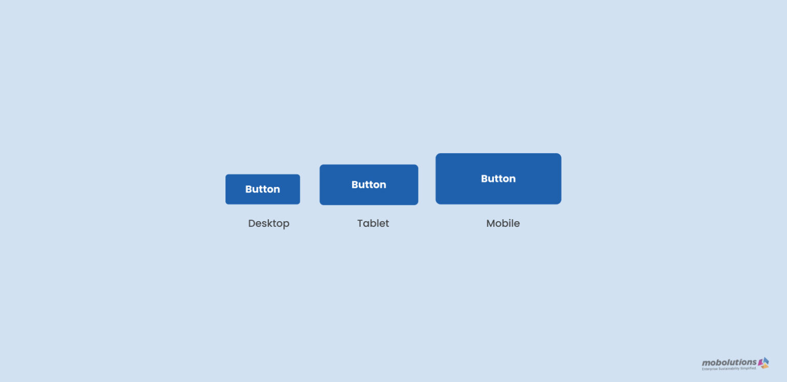
Fig 3: Comparison of button size between Desktop and Tablet and Mobile.
Conclusion:
Following the UI UX guidelines summarized by SAP will be a perfect way to design User-centered Mobile products. To add on, look into Google’s Material Design Guidelines and IOS’s Human Interface Guidelines. For more details, please reach out to Praveen / Ashish